
margaret martin
Project 5
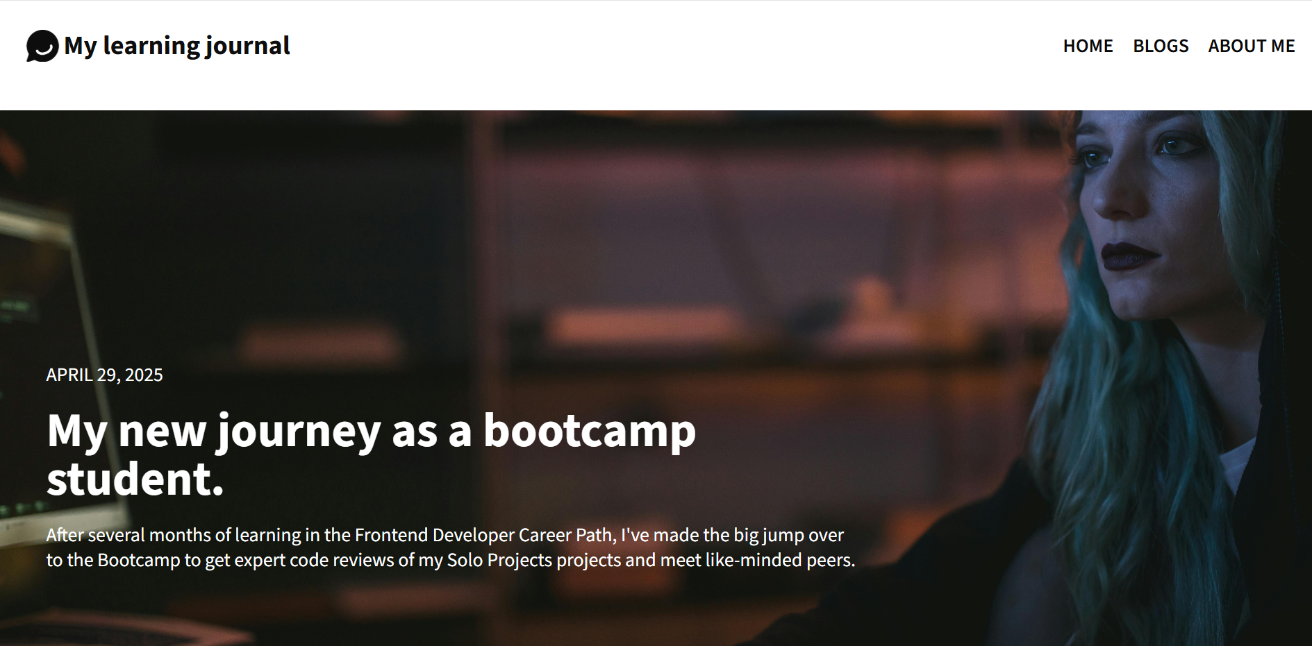
Multi-Page Responsive Blog Website
Originally designed as a blog-style learning journal, this three-page responsive website was built entirely from scratch using semantic HTML and CSS. The homepage features blog-entry previews; clicking each preview opens a dedicated page with the full article. The third page serves as a custom “About Me” section. All pages include a consistent header and footer, with navigation links for a seamless user experience. I used a mobile-first approach and implemented CSS Grid for complex layout structure, then later refactored parts of the layout with Flexbox to enhance responsiveness and spacing. This was a foundational project for practicing project structure and multi-page navigation—plus, I later repurposed the site into my current portfolio!
What I Learned
This project gave me hands-on experience building a multi-page site from scratch. I practiced using semantic HTML to structure content clearly, and styled the layout with a mobile-first approach using relative units and media queries. I used CSS Grid to organize the page structure and later added Flexbox to improve spacing and responsiveness. Creating consistent navigation and reusable elements across pages also helped me better understand how to manage shared styles and page structure in a multi-page website.